
Acclima Soil Monitoring logo & branding design.
New logo and brand for a very unique company with proprietary products.

Rebranding intelligence.
Does your brand match the energy your business puts out?
Acclima, a company based out of the Boise, Idaho area, design and manufacture specialized sensors that sit in the ground and measure the water content of the soil. This information is then relayed to the farmer, groundskeeper, etc. so that they can more effectively water the crops. By doing this, they can know if they are under watering or over watering their land and therefore conserve their water usage.
It's all very technical stuff designed by some very intelligent people with decades of agricultural and electrical engineering experience.
DIGITAL SKETCHES
In May of 2016, Jaidyn decided that it was high-time that she take the plunge into doing energy work for others. She became certified in Reiki 2, continued to learn and implement other forms of energy and emotional healing, and was open for business. However, she needed a brand that reached beyond her given name because she knew that this direction in her life was meant for big things. She eventually landed on the name Red Thread, which comes from and ancient Asian belief that we are connected to those we are supposed to meet and help in this life by a thin, invisible red thread tied to our pinky fingers. The symbolism was perfect.
REVISIONS
“With logo design, it is never love at first sight.” - Sagi Haviv
Revisions are necessary to really dig into the concepts, because that is all they are. They are a jumping off point for when the real designing happens.
Here is the results of the first round of revisions. As you can see, it’s basically a new logo. I learned new information during this process that helped to design a logo that was more accurate, but it still wasn’t there yet.
Let’s flesh out Acclima’s branding, shall we?
If you’ve been following my blog, you know that a logo is not enough to build a great brand, but it is a jumping off point. You need things like a color palette, iconography, typographical rules and certain fonts you use, etc etc. All of these things and more help to create a consistent and cohesive brand no matter what you’re designing – be it a website, thank you card, or social media images.
To help with this, I always create a brand style board at the very least. It serves as a “masterfile” where I can find all of the logos, official colors and their formulas, and other helpful things that I end up using a lot. Here’s a shot of the style board I created for her.


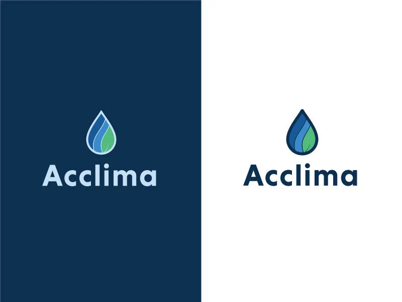
The final logo underwent even more changes that more accurately embodied the company and all they do. We incorporated the radio signal to illustrate how their sensors work, along with water and a leaf to show the other aspects of their business.
WHEN WILL IT BE IMPLEMENTED?
This branding has unfortunately not been implemented as of yet. I’m not sure as to the reasons why, but as with any business, I’m sure a lot needs to be done before they can roll this out.


Free 30min brand strategy call!
Let’s chat about your brand’s needs and what I can do to help.