
Idaho Falls, ID USA
Greater Idaho Falls Chamber Logo Design Rebrand
Rebranding 120 years of history.
The Greater Idaho Falls Chamber has served its community for 120 years! After all that time, the organization desperately needed a new image to attract new businesses and shed the baggage of the past.
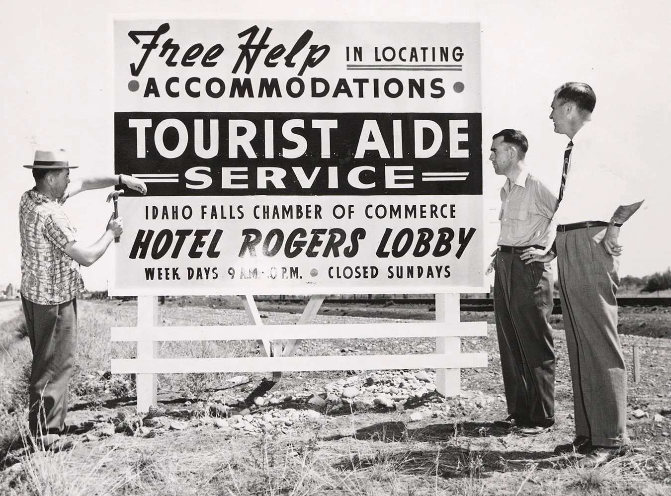
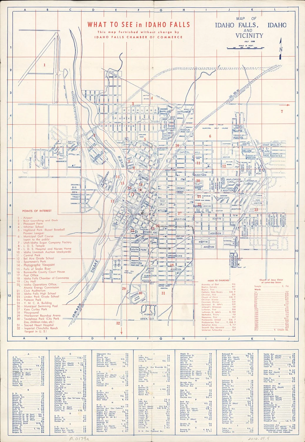
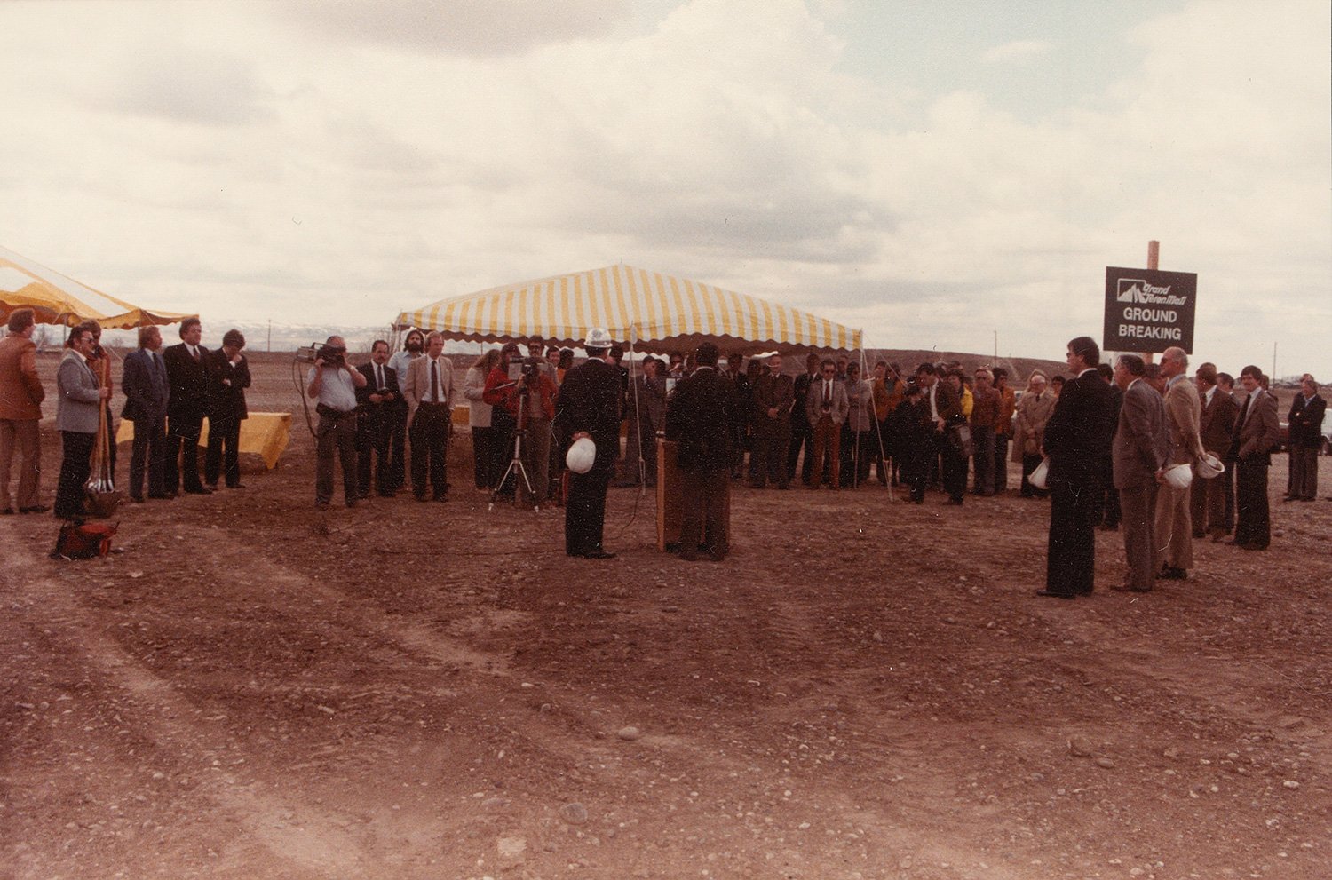
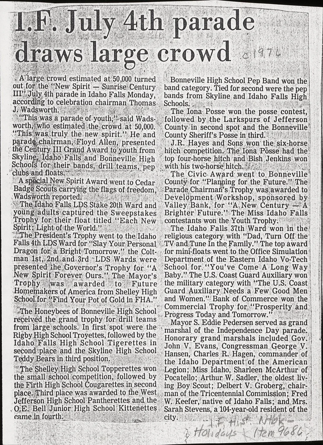
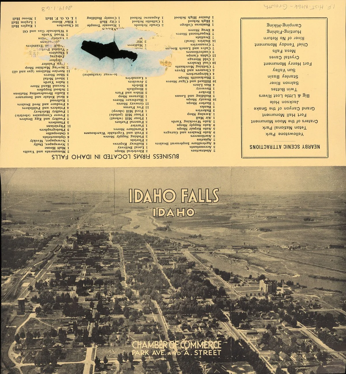
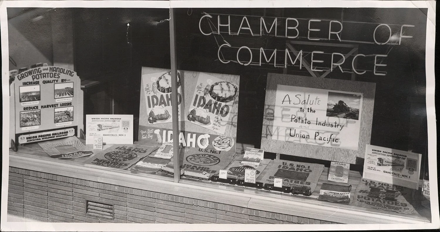
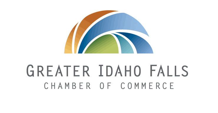
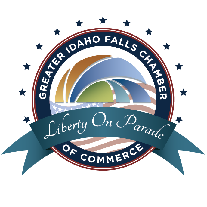
Rebranding a 120-year legacy.
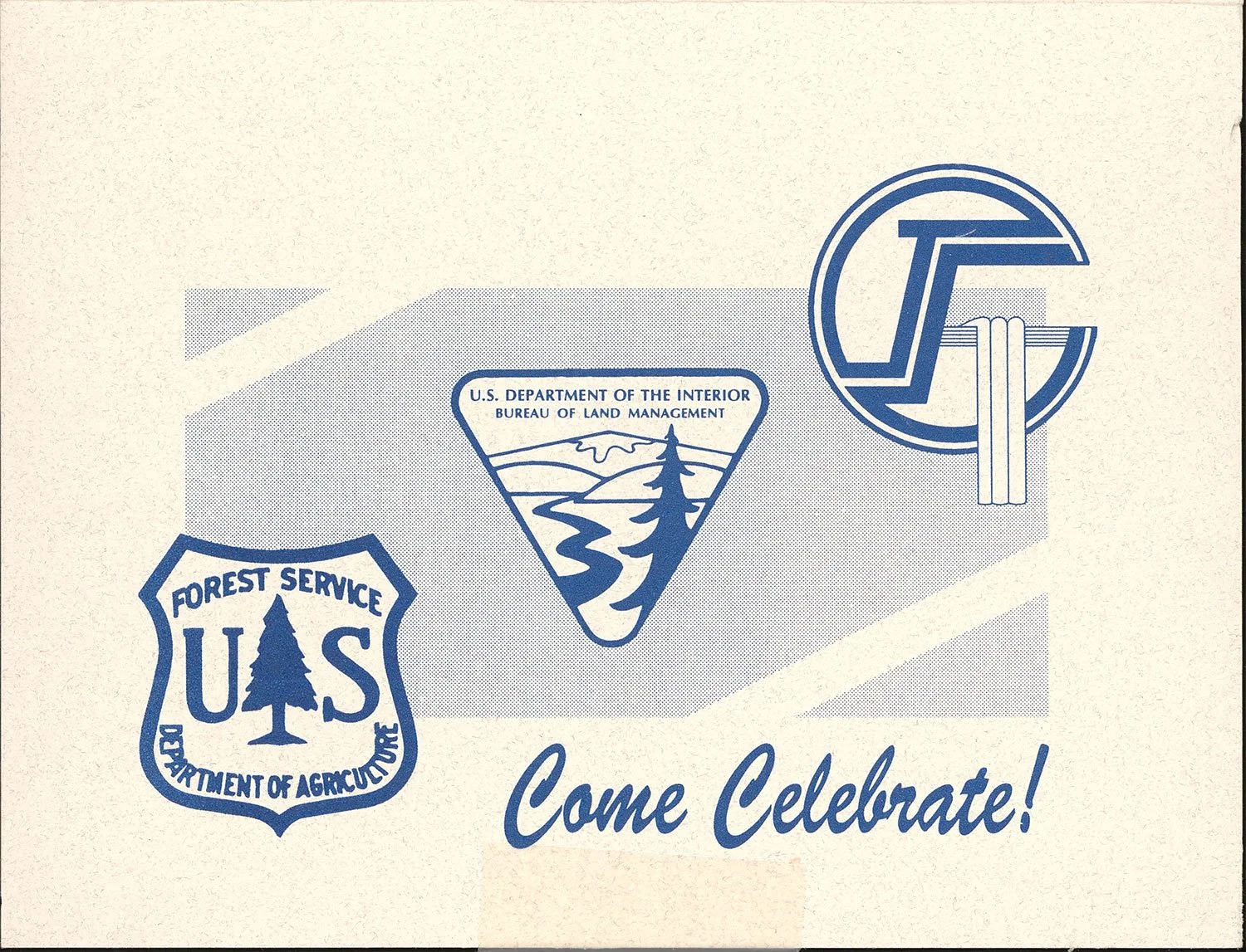
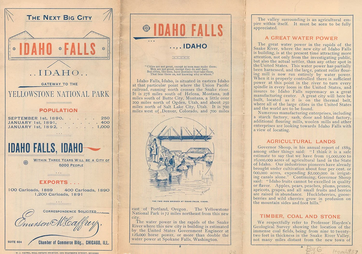
In the 120-year history of the Greater Idaho Falls Chamber of Commerce, we were only able to uncover 2 logos that were used over the years.
It was time for the Chamber to have branding that represented the heart and soul that their employees pour into everything they do. From organizing networking events and educational programs to advocating for local businesses at the government level, the Greater Idaho Falls Chamber works incredibly hard to create an environment where businesses can thrive.

Selecting the branding committee.
With any project for an organization such as a chamber of commerce, you have a board of directors to work with. From the kickoff, we worked with the board to select a group of 4 individuals who would be granted decision-making power for the branding project.
This step is incredibly vital because it keeps the project moving forward without getting bogged down with too many opinions being voiced. I recommend doing this with any logo design or branding project with many decision-makers.
Mood Boards
On every branding package I do, I create a couple of mood boards based on the style preferences we have landed on through branding questionnaires and Pinterest boards. I send these to the client to make sure I’m on the right track before I start sketching logo concepts.


Digital Concepts
Concept 1 | Syringa
The syringa is Idaho’s state flower, with a unique petal pattern. I designed this option to showcase something that was Idahoan and recognizable. The chamber wanted to see options that didn’t only showcase Idaho Falls, since the goal was to unite the area.


Concept 2 | Logotype Falls
Here I focused on creating a unique monogram using curving lines to symbolize the falls and snake river that form the lifeblood of our valley.


Concept 3 | Waterfall G
The idea for this concept was spawned from a previous IF Chamber logo. The old logo, which can be seen in an above section, shows the waterfalls pouring over the edge of the G. I decided to pay homage to that concept, but creating an updated version. Focusing on the G was a conscious decision because putting a larger emphasis on the greater Idaho Falls area was a big part of the rebrand in general.


REVISIONS
After presenting the original concepts, we began the revision process to perfect and further explore two of the options. The Syringa flower and the Waterfall G.
I also began experimenting with the typography, or logotype, of the logo. You can see me playing with custom serifs, angled crossbars, and arced text to bring emphasis to the word “Greater”.
Once we narrowed the idea down to the waterfall G option, I began playing heavily with the finesse of the G. Does it have facets? A cutout? Angles? 3-D? More illustrative? I tried to exhaust the options as much as I could.


What was the verdict?
Final Logo Design

After much deliberation, the Greater Idaho Falls Chamber team decided that their chosen emblem perfectly encapsulated their mission and community spirit.
The Chamber selected the Whole Shebang package, receiving a comprehensive logo suite in various file formats, multiple logo versions and layouts, a custom color palette with specifications, an inspiring tagline, and recommended fonts.
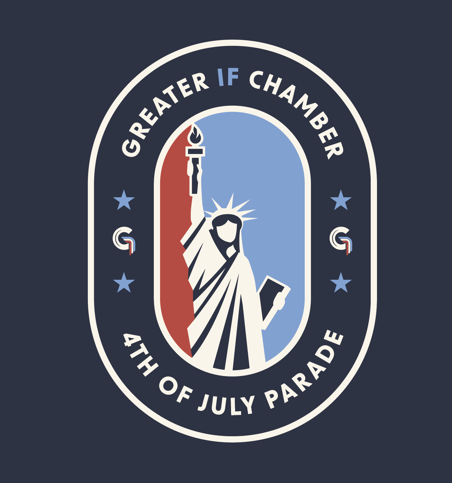
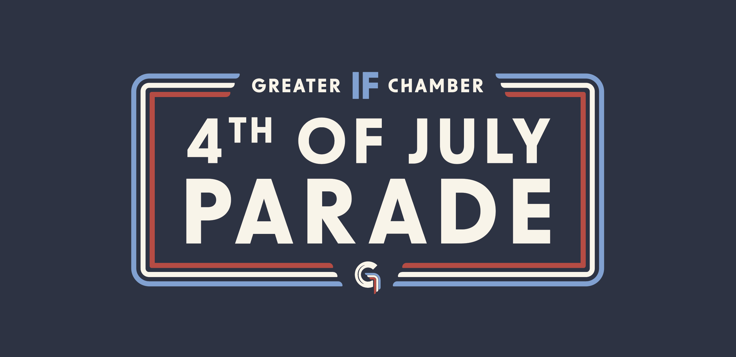
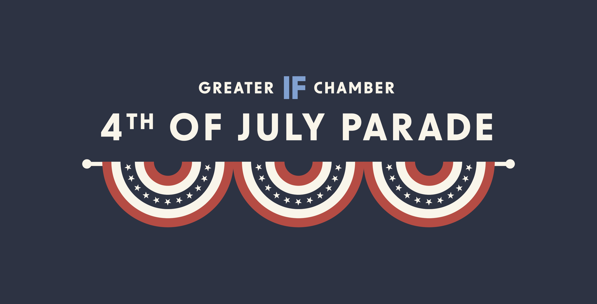
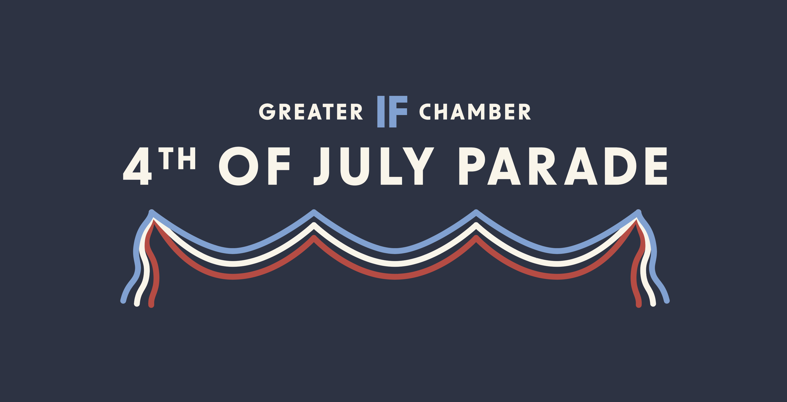
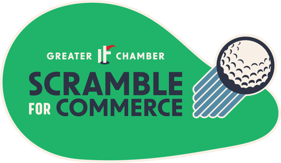
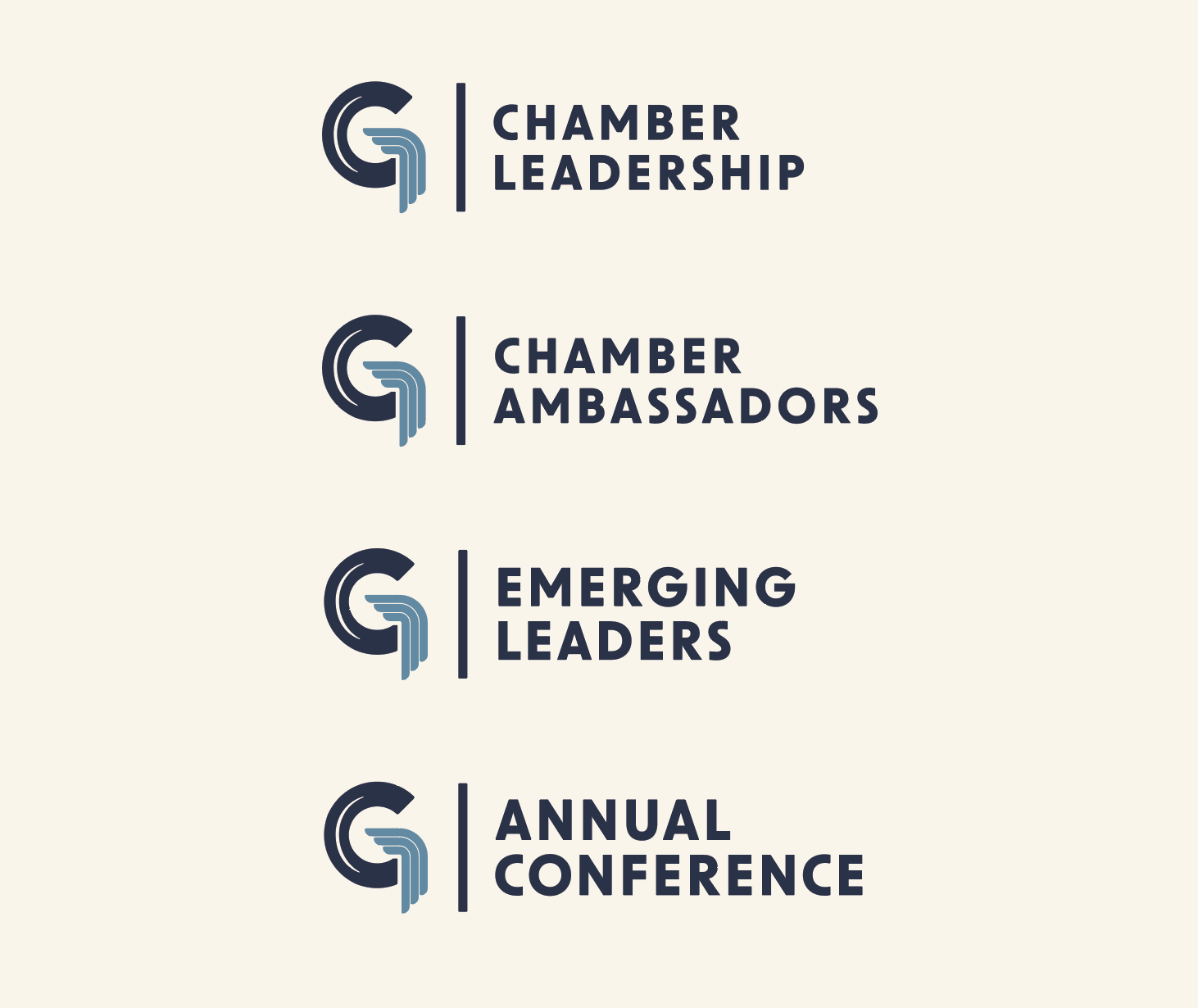
Within this branding package, we also completed rebranding efforts for all of the events that the Chamber organizes.
Included in their package was a master logo file and full style guide, available in both Adobe Illustrator .ai and .PDF formats. This file, showcasing all essential branding elements in one place, is invaluable for sharing with sign makers or other designers to ensure brand consistency across all platforms and materials.
Ongoing Design Work
After finishing the foundations of the Chamber brand, we began fleshing out the functionality of the brand and answering questions like:
How do the colors work together?
What fonts will work well for marketing materials?
How will the brand work with Chamber events, groups, initiatives, etc.?